
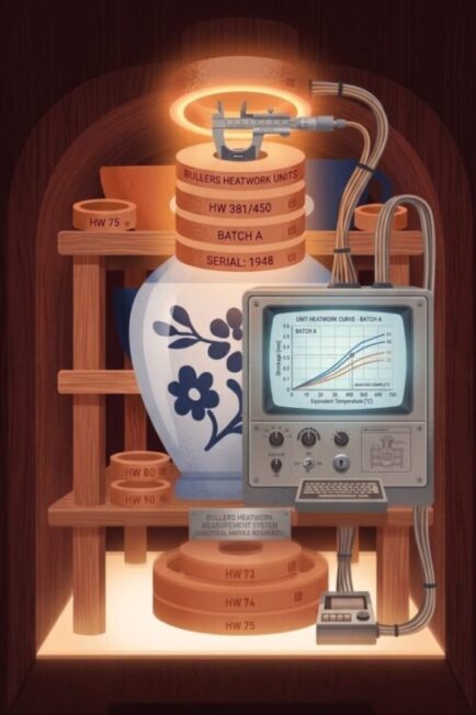
Use the Bullers™ Rings Heatwork tool First
How to Use the Analysis Tool
- Calculate First: Process your raw ring measurements in the primary Bullers™ Heat Work Tool.
- Transfer Your Data: You can bring your completed data into this tool in two ways:
- Automatic Transfer (Recommended): Simply click the automatic transfer button at the bottom of the Heat Work Tool to send your data over to the analyzer instantly.
- Manual Copy & Paste: If you prefer, you can copy the generated output data from the first tool and paste it directly into the Data Entry box here, then click Process.
- Add Context: Fill in your target temperature, kiln ID, and batch details in the Settings & Context panel for accurate reporting.
- Analyze & Export: Review your charts and click Standard Report or Diagnostic Report to print or save your firing analysis.
Why Use This Tool? (The Benefits)
Whether you are a hobbyist or running a production studio, analyzing your heat work data takes the guesswork out of kiln management:
- Diagnose Kiln Health: Identify failing elements or drafty doors before they ruin a load of work.
- Optimize Packing: Learn exactly how your shelf density affects heat flow so you can pack smarter.
- Improve Glaze Consistency: Ensure predictable, repeatable glaze results by keeping your heat work tightly balanced.
- Actionable Tuning: The Diagnostic Report gives you algorithmic suggestions on how to adjust your programmer’s ramp rates and soak times.
Understanding Your Graphs
Once your data is processed, the tool generates several visual models to help you understand exactly what happened inside your kiln:
- Temp by Ring (Bar Chart): Shows the exact calculated temperature for every individual ring. Quickly spot specific rings that missed the target.
- Distribution Cloud (Scatter Plot): Groups rings by layer (Top, Middle, Bottom). A tight cluster of dots means an even firing; widespread dots indicate high variance and uneven heat.
- Δ Deviation (Bar Chart): Shows how much a specific ring drifted from its shelf’s average. Green bars pointing up mean it was hotter; red bars pointing down mean it was cooler.
- Compass Radar (Polar Map): Maps temperatures based on physical location (North, South, Centre, etc.). A perfectly even kiln makes a circle; a lopsided shape instantly highlights directional biases like a cold door.
- Heat Map (Grid View): A top-down, color-coded grid of your kiln. Red cells highlight primary hot zones, and blue cells highlight primary cold zones.